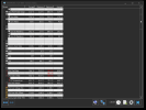
Not sure what exactly you mean. The coumn grid lines of same color as the lines in table header?Edit: any chance you could try row borders with the same grey as the column borders in your screenshot?
Last edited:
Not sure what exactly you mean. The coumn grid lines of same color as the lines in table header?Edit: any chance you could try row borders with the same grey as the column borders in your screenshot?


Hello Martin and everyone, I just registered to give my 2 cents on the topic since I just updated to 6.30 (and the new beta build).
Because I work in dark environments mostly bright things aren't keen on the eyes, but getting a dark theme "right" (quotes because that's subjective) on an app that's not managed isn't trivial, to the point that not many I can think of feature a dark theme. Even on fully managed apps like paint.net, I keep the light theme on by default because of the contrast between areas where sometimes you get dark-ish colors all around but plain white on some things (I think I'll report it there too in case there's a way to tweak it).
Here, what I experienced in 6.30 was the usual when a Win32 app goes dark, the borders of the containers don't seem to be proportional in contrast to the background. In the system summary window for example, which is packed of boxes it's easy to see what I mean. This would be the default for the light theme:
View attachment 5102
You can see different kinds of controls in there, lets take a look at one of the main ones, the CPU at the top left corner. You see the tone of the line that surrounds that area is rather subtle compared to the background. Then there are several other controls that are "sharper" so to speak and the delimiting lines are dark grey.
Now let's take a look at the dark mode (in 6.31, I switch to that for now to keep using the light mode for a while longer at least):
View attachment 5103
Does anyone think it's more crowded than the previous screenshot despite showing essentially the same data? It's because of the contrast, take a look at that CPU box again, the line now has a plain white component. It was a single pixel wide before too and now it's two which also plays a part, but what I think breaks the loop the most is the plain white over the dark background. Makes it very look off for some reason (in my mind).
Another Win32 application with a nice looking (in my opinion) dark theme (still experimental mind you, so only in nightly builds) is the open source Process Hacker task manager:
View attachment 5104
The main interface seems to use paler, more pastel looking colors for some things, but while the system information tab shows more vivid colors, the lack of borders on some controls or the subtler grey (#DFDFDF) in that "Show one graph per CPU" checkbox makes it feel more at home. Lettering is still plain white from what I can see and in some places less vivid colors could make it look better, but overall it's a look I don't mind seeing:
View attachment 5105
That "More" button at the lower right is surrounded by a very subtle darkish-grey #414141 and the "Back" one at the lower left doesn't even have anything surrounding, it just shades blue (#273541, darker than the highlighted "Memory" section) when you're over it with the mouse.
There's still plenty of contrast with the white lettering and that orange for the section titles compared to the dark background, but it doesn't seem too jarring. Subtler would look better for my taste, but it's alright as it is.
I don't know if all of this helps, but the more examples the better and little by little things get refined. Just look at the changes in shading between 6.30 and 6.31, a step in the right direction and much appreciated
How were you able to get row shading to start working? My row shading is enabled but the rows are all uniform in color?
View attachment 5110
Ah that was it, thanks for the response.Is perhaps "Keep Theme" enabled in the main HWiNFO settings? If yes, disable it.
Here a preview on next update to DarkMode to improve contrast. Pay attention to edit and group boxes - now the lines are thinner and darker.
I hope this change improves the appearance, it will available in the next build.
When is the newer version going to be availabe? I really dislike the current dark mode in v6.30.
Thank you for listening to the community Martin! and for all your hard work!
Is perhaps "Keep Theme" enabled in the main HWiNFO settings? If yes, disable it.
Hi Martin,
Also, signed up to say Thank you for developing HWINFO.
However, I'm with many others here and am willing to put up a bounty to develop the option to go back to the original light theme - even if you have dark mode enabled. Love the program and have been using it for years, but it literally makes me ill to look at the program for extended periods of time with dark mode enabled. The original look and feel was perfect overall.
Thanks again for all the hard work.
 www.hwinfo.com

Hello,
I am using a High contrast dark theme for windows.
It is called GreyEveTheme.theme and it's from https://github.com/nitschis/GreyEveTheme/releases/tag/v1
This theme works great to make everything else dark in windows, like those white title bars
However for some apps with a built-in dark mode, it messes up the dark mode and the fix is to disable the dark mode in that app only.
Where is the setting to disable hwinfo's own dark mode manually ?
Here is what this looks like
View attachment 9215
