PiersJH
Well-Known Member
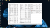
This is presently how I have HWiNFO set up. It doesn't take up the full screen and displays the readings in a way I like. However, if you look at the bottom of the middle column, the "S.M.A.R.T.: WDC WDS100T...." device's information is split between the middle column and the top of the third column.
It would be great if a feature could be added to insert a blank or spacer line - essentially giving users the option of having an additional two or three lines above the "S.M.A.R.T.: WDC WDS100T...." so that device's information only appears on the third column, rather than being split between two.
Here is how it currently looks:

Here is how it would look with an option to 'insert blank/spacer line'

I hope that makes sense and that the very crude mockup demonstrates the point. I don't know if this would be a massive change to introduce, but it would very much be a welcome one.
It would be great if a feature could be added to insert a blank or spacer line - essentially giving users the option of having an additional two or three lines above the "S.M.A.R.T.: WDC WDS100T...." so that device's information only appears on the third column, rather than being split between two.
Here is how it currently looks:

Here is how it would look with an option to 'insert blank/spacer line'

I hope that makes sense and that the very crude mockup demonstrates the point. I don't know if this would be a massive change to introduce, but it would very much be a welcome one.

